EDSI & Chloe Parent Design: an award winning project.
EDSI (Egg Donor & Surrogacy Institute) is a Beverly Hills company helping intended parents fulfil their dream. As their clientele is expecting the best and safest medical service as well as the highest quality of personalized attention in every aspect of their relationship with EDSI, the company’s CEO, Parham Zar, decided to redefine their image so it inspires strong trust, conveys reliability, safety, top medical technology but also has a great human dimension. He also was open to steer away from the conventional “baby” color scheme and imagery (pastel and soft images). After redesigning the logo, I worked on the new website. The concept was to stronger impact to mark the reliability, safety and strength of both the company and the process of becoming parent through EDSI. While visually powerful, the selected photos first convey kindness, love, availability and generosity, which was essential to translate EDSI’s unique approach. After the site was live, I reworked many other materials in both English and Chinese (brochures, 3-folds, flyers, stationary, PPT animation, etc.). The entire campaign was rewarded by two Gold HERMES Creative Awards in 2014.
Blue Communications (OneBeacon campaign)
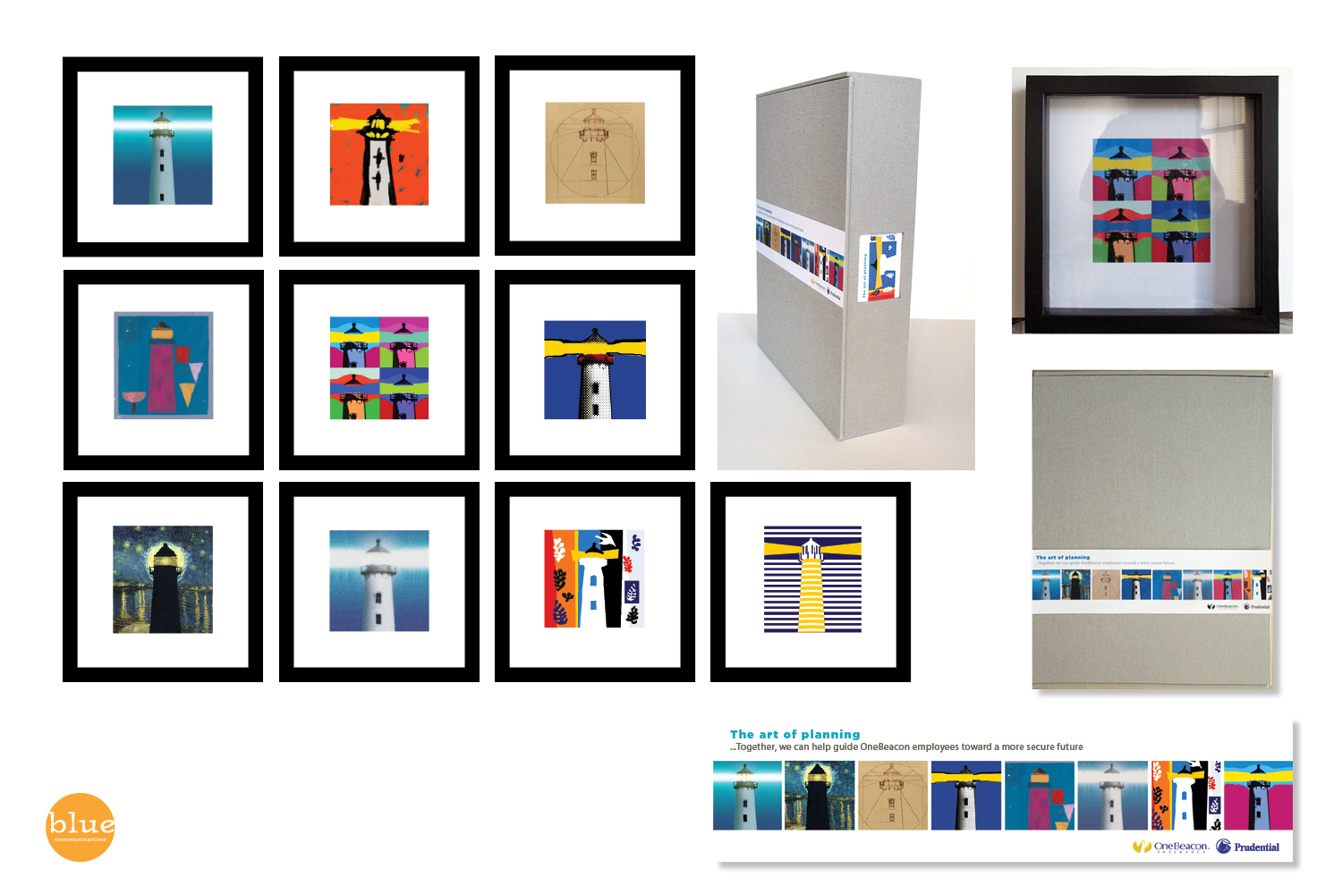
Award-winning communication agency Blue Communications created a full HR campaign to promote 401K plans for One Beacon's employees: The theme and tagline of the campaign was: "The Art of Planning". And OneBeacon's imagery and logo were lighthouses. So it was decided to use the lighthouse theme in styles reminiscent of great art masters. I created the design for all the materials for the campaign as well as all the illustrations inspired by major artists (Seurat, Klee, Van Gogh, Da Vinci, Warhol, Basquiat, Matisse, Lichtenstein, Vasarely, etc.). The campaign was very much appreciated and little frames were created to showcase the illustrations in offices.
FAM, a successful visual identity transition
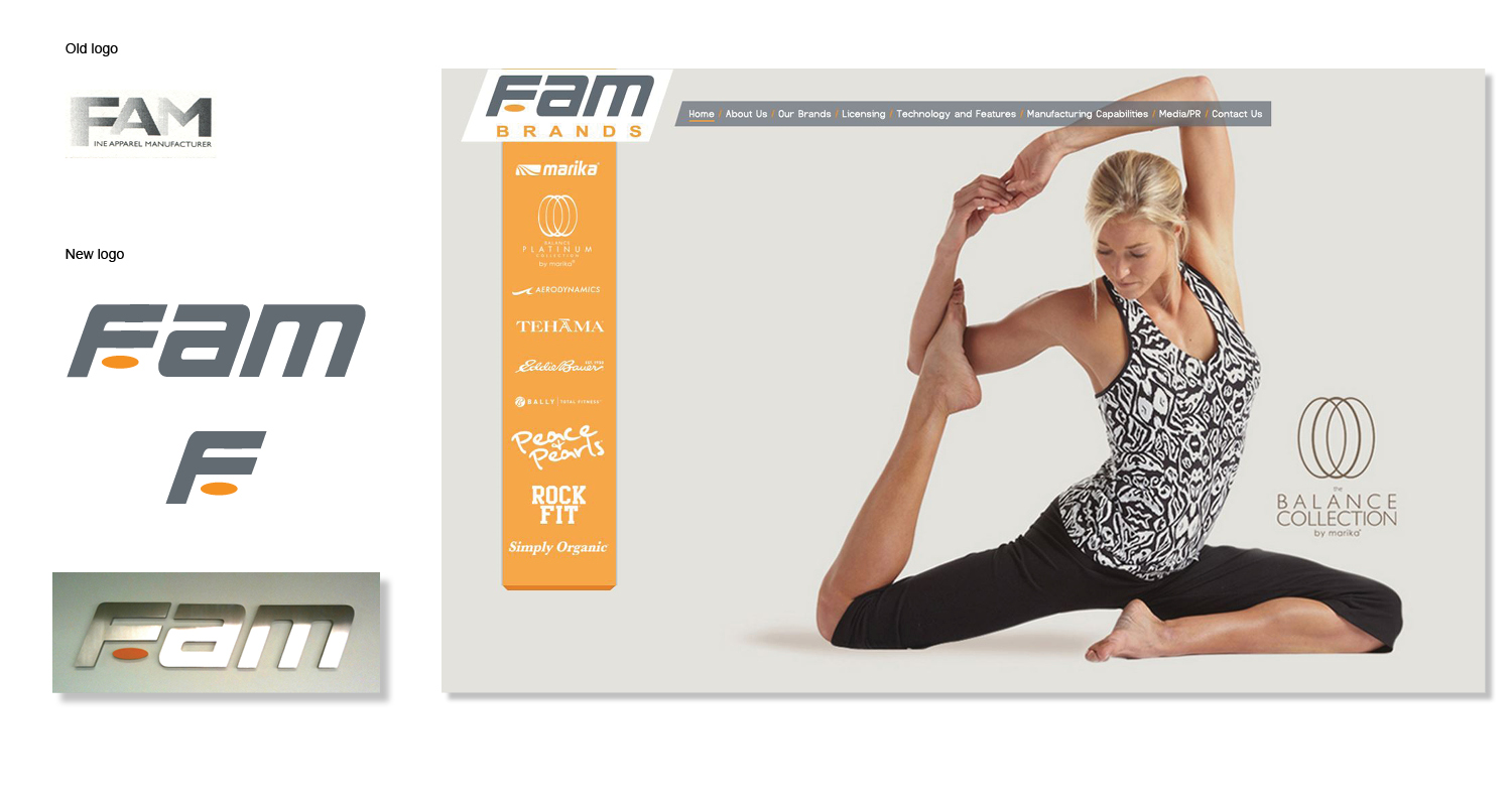
As Fambrands, a Los Angeles company designing, manufacturing and distributing fitnesswear and lingerie, grew to include more brands and created more lines, it was decided to give it a new look. Frank Zarabi, CEO, asked us to redesign their logo to match the shorter name but also to visually point to fitness as the main focus and production of the expanding company. The logo is now used on all their communication and marketing materials and contributes to FAM's image as a key player and leader in the fitnesswear industry.
The movie makers and the design studio are “Thicker Than Thieves”
I was contacted by Urs Buehler (director) and Lars Sylvest (producer) as they were shooting their movie “Thicker Than Thieves”. They needed a visual identity for their new production company, Mondrian, as well as all marketing materials for the movie. I designed both to their greatest satisfaction. My first suggestion was to create an impactful TTT logotype (as the movie title was long), then colorized and retouched set photos into powerful iconic images that became the visual ID for all marketing pieces including sleeves, labels and posters.


